 the-ish.com/blog
Leopard Window Buttons = Ugly
I’m not sure if I’m alone on this one, but the close / minimize / maximize buttons in leopard totally disgust me.
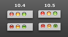
There is just something about them… I’m having a hard time putting my finger on it exactly, but i know i don’t like them.
The 10.4 buttons were a bit more subtle, and these new ones seem to be just a bit too cartoony, over saturated and somewhat blurry… they look out of place to me.
(note: the 10.4 example above is actually just iTunes in 10.5, which retained the 10.4 look until the iTunes 7.5 update.)
Anyone else cringe just a little every time you see those buttons?
I agree. I don’t know if it’s the shinier sheen or the blurriness, but they’re awful.
Mark - December 5th, 2007 at 3:13 pm
i know you posted this a long time ago, but they also 100% make me want to puke. i think i hate them more then you.
they were already like a bright blinding streetlight before, but now i can see them with my eyes closed.
Christian - January 20th, 2008 at 10:03 am